
Cross-Platform Design: Working Across Apple and Google Without Losing Your Point of View
About the Author:
Nicolas Solerieu is a product and brand designer at Expo, working across product, web, and brand identity. Previously at GitHub and Opendoor, he’s interested in software, the web, and the strange craft of arranging rectangles for a living.
Apple and Google have become increasingly opinionated about expressive design, making cross-platform design a fun, hot topic. It is also hard to navigate, given how many form factors and platforms exist today. Apple’s Liquid Glass leans into translucency, depth, and fluidity. Google’s Material 3 Expressive favors bold shapes, colors, typography, and springy motion. Both are compelling, and each has its own personality. Neither is guaranteed to suit your brand.
That creates an interesting dilemma when you design one product for both ecosystems, and beyond.
Cross-platform development has long promised parity: one codebase, one design system, and ideally the same experience everywhere. The efficiency makes sense. A consistent product still doesn’t need to look identical on every platform, and making everything match can become a strange priority. None of your users compare screenshots. They’re just trying to use the thing.
Know the rules before breaking them
Designing for multiple platforms requires some familiarity with each ecosystem. App designers working across both should:
- Understand device constraints, safe areas, and system UI.
- Follow established navigation and interaction patterns.
- Know when to use native components and controls.
- Use both platforms regularly, particularly their default apps.
That last one is where the gold is.
You can learn the guidelines and UI kits. Knowing how something should work still doesn’t tell you how it should feel. That’s where design judgment, or taste, comes in.
Opening a menu, dismissing a sheet, going back a screen: ordinary stuff, until something feels slightly off. Timing, gestures, and transitions are difficult to appreciate in a Figma file. Spending time on both platforms helps you notice the expectations you’ve stopped noticing on your own phone.
The documentation is extensive. The examples are in our pockets. We might as well use them.
Decide what makes it yours
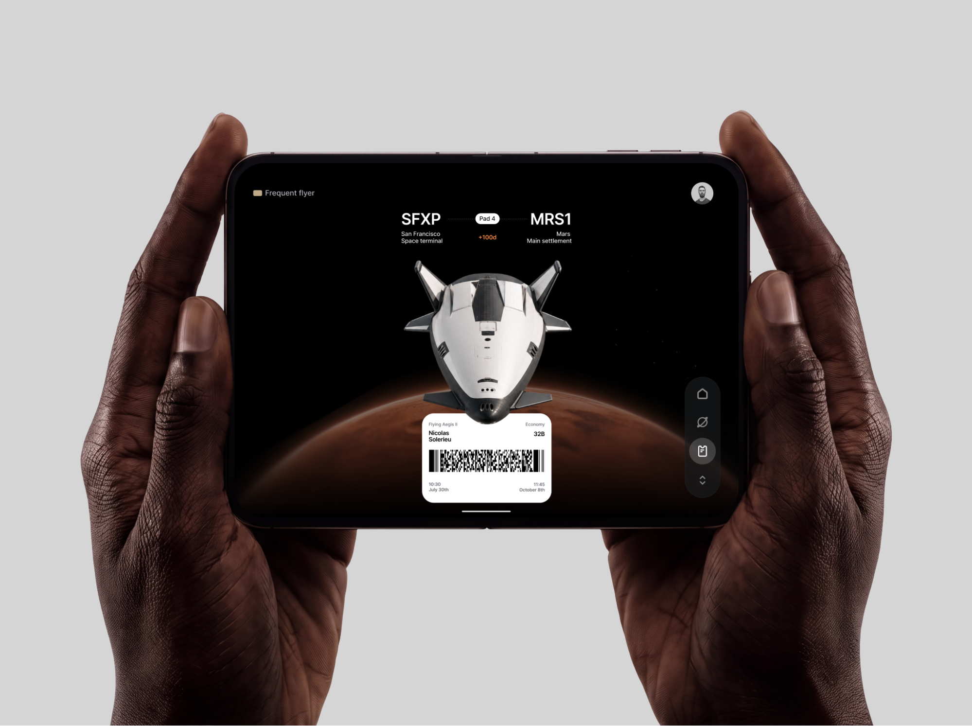
Before deciding what should change between platforms, establish what should stay consistent.
Your product’s identity might come from its typography, illustration, writing, or information hierarchy. Perhaps it’s a particular interaction or the physical product itself. Perhaps the content does most of the work, and the interface can stay quiet.
Consider a space travel app. I’m using a concept here, so we can conveniently skip the engineering complications of getting to Mars.
Large planetary imagery, spacecraft, deep black backgrounds, and compact flight information establish its visual world. Those qualities can carry across platforms even if the menus and navigation differ. The spacecraft looks cool, but at its core, this is an airline UX with booking, boarding, and onboard experiences.
The useful question is what people would recognize as yours. A particular corner radius probably won’t carry the whole brand, and neither will translucency.
A checklist for the native-versus-custom debate
You don’t have to choose between fully native and fully custom. I’d argue that deciding for an entire app is usually the wrong approach.
Judge it at the component level. Here are a few questions worth bringing into a design review:
- What does the user already know? Preserve familiar navigation, gestures, and controls unless changing them offers a clear benefit. Learning your app shouldn’t require them to unlearn their phone.
- What does customization contribute? A clearer visualization? A better interaction? Some personality? All valid reasons. “We wanted our own button” needs a little more explanation.
- What should stay consistent? Identify the language, information hierarchy, and visual qualities that define the product. Give the team something concrete to preserve.
- Have we tried the whole flow on both devices? Include the keyboard, menus, transitions, and system UI. Two tidy screenshots can hide two very different experiences.
- Does it survive ordinary complications? Larger text, long names, reduced motion, screen readers, loading, and errors. The flattering mockup is only one state.
- Can we maintain it? Involve app developers early and document intentional differences. A clever variation becomes less charming when nobody remembers why it exists.
These questions won’t make the decision for you. They should make the discussion more useful.
Put it to work: a flight to Mars
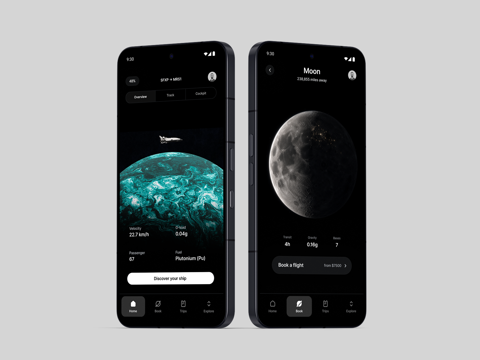
In the space travel concept, browsing destinations is a good place to build something custom. Large views of Mars and the Moon make exploration part of the experience. A shared layout gives unfamiliar information, such as gravity, transit time, and available bases, a predictable structure.
The imagery provides the spectacle. The hierarchy helps people compare. Both are worth preserving across platforms.
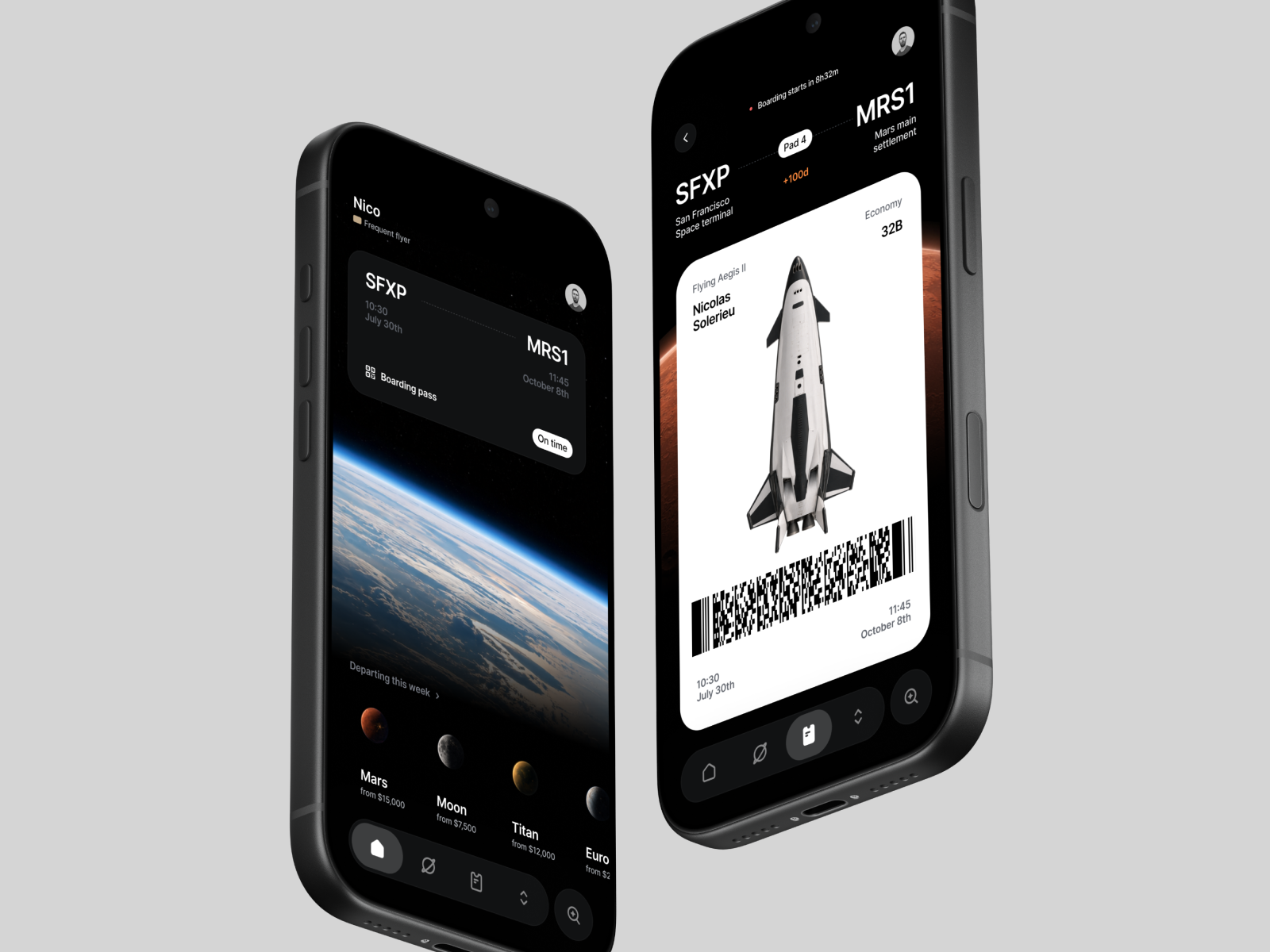
The boarding pass calls for a different balance. The spacecraft image gives it personality, but departure time, boarding status, seat, and barcode still need to be immediately readable. A beautiful ship won’t help someone find their gate. A boarding pass is a familiar pattern that doesn’t need reinventing.
This is where the checklist becomes practical. What happens with a longer passenger name? Larger text? A delayed departure? Those states should influence the layout before we get too attached to it.
The flight tracker offers another chance to create a signature experience. A spacecraft above a planet gives the journey scale, while progress and telemetry communicate its status. That visualization could remain consistent across platforms, with motion respecting accessibility preferences.
Around these moments, passenger selection, sharing and routine menus can follow platform conventions. There’s plenty of room for personality without redesigning every supporting control.
Flexibility has a cost
Some products benefit from leaning heavily into their operating system. Utility apps often gain more from familiarity and efficiency than from an elaborate visual identity.
Others, like Duolingo, have built a recognizable world of their own. Their personality is part of the experience. Most products sit somewhere in between.
There’s work involved either way. Platform differences need designing and testing. Custom controls need accessibility and interaction details that standard components may already handle.
For a small team, sharing most of the interface can be a perfectly reasonable choice. Spend the extra effort where you can explain what it improves. You don’t need a philosophical commitment to either extreme.
Let the technology follow
Frameworks like Expo make this approach practical. With Expo UI, developers can use native SwiftUI and Jetpack Compose components alongside custom React Native interfaces. For the space travel concept, that could mean native booking controls alongside a custom planet browser and flight tracker. The implementation follows the role of each component.
The native-versus-React-Native debate often treats cross-platform as a compromise you make until you can afford something better. From a design and brand perspective, I find that framing pretty limiting. A shared interface can be a deliberate choice. Your product has its own point of view, and preserving it across devices is a perfectly good ambition.
AI makes this even more interesting. Agentic workflows and simulators make it easier to generate separate implementations. Keeping them coherent, testing them, and refining the details still takes work. More code isn’t automatically more progress. I’d rather spend that effort improving the experience than maintaining differences nobody asked for.
That’s why React Native and other cross-platform frameworks appeal to me as a designer. They give small teams room to build a recognizable product, share the work that benefits from consistency, and adapt where the platform calls for it. That flexibility serves both the brand and the reality of building something.
Respect the platform. Apple and Google already have art directors. Your product needs one too.
Find more Community stories on our blog Courtside. Have a suggestion? Contact stories@dribbble.com.
内容来自 Dribbble,版权归原作者所有。
阅读原文 ↗