
The Website Go-Live Checklist: 5 Critical Checks Beyond Good Looks
About the Author:
Anthony Dutcher is a Founding Partner at Vix Media Group, a Denver-based agency working across healthcare, technology, and media. His team is deliberately split between agency and in-house backgrounds and runs its own infrastructure, so it has sat on both sides of the brief. He believes research should drive design decisions.
A website can look finished before it is ready to use. The opening screen feels confident, the presentation goes well, and everyone agrees it looks better. Then somebody tries to find a specific service or send an inquiry from their phone. That moment is why every launch needs a website go-live checklist that goes beyond good looks.
That is the review I care about. At Vix Media Group, I want website development judged by what a visitor can understand and do, along with what a team can present.
In an October 16, 2026 project review, the report marked 31 of 32 requested changes complete. I still felt the work needed better judgment. The report told me which changes were done. It could not tell me whether the pages communicated well.
That distinction costs time if you discover it late. A completed checklist is useful, and judgment still has to sit on top of it. These five checks give the business owner and marketing team a practical review before sign-off. They complement the security, accessibility, and technical launch checks your web developers run.
1. Read the page as a customer would
Start with the question the visitor came to answer. Someone comparing services needs different information from someone who already knows what they want and needs to book.
For each important page, ask:
- Can I tell what the business offers and who it is for?
- Can I find the information I need to compare or trust it?
- Do I understand what happens after I contact the business?
Read the sentences and headings. “Solutions designed around you” could belong to almost any company. “Interior design for offices, from layout planning to installation” gives a buyer something to work with.
Specific copy can still have personality. Good copy has a point of view and still answers the question. If the team has to explain the page over a call, put the missing explanation on the page.
2. Keep the character. Cut the friction.
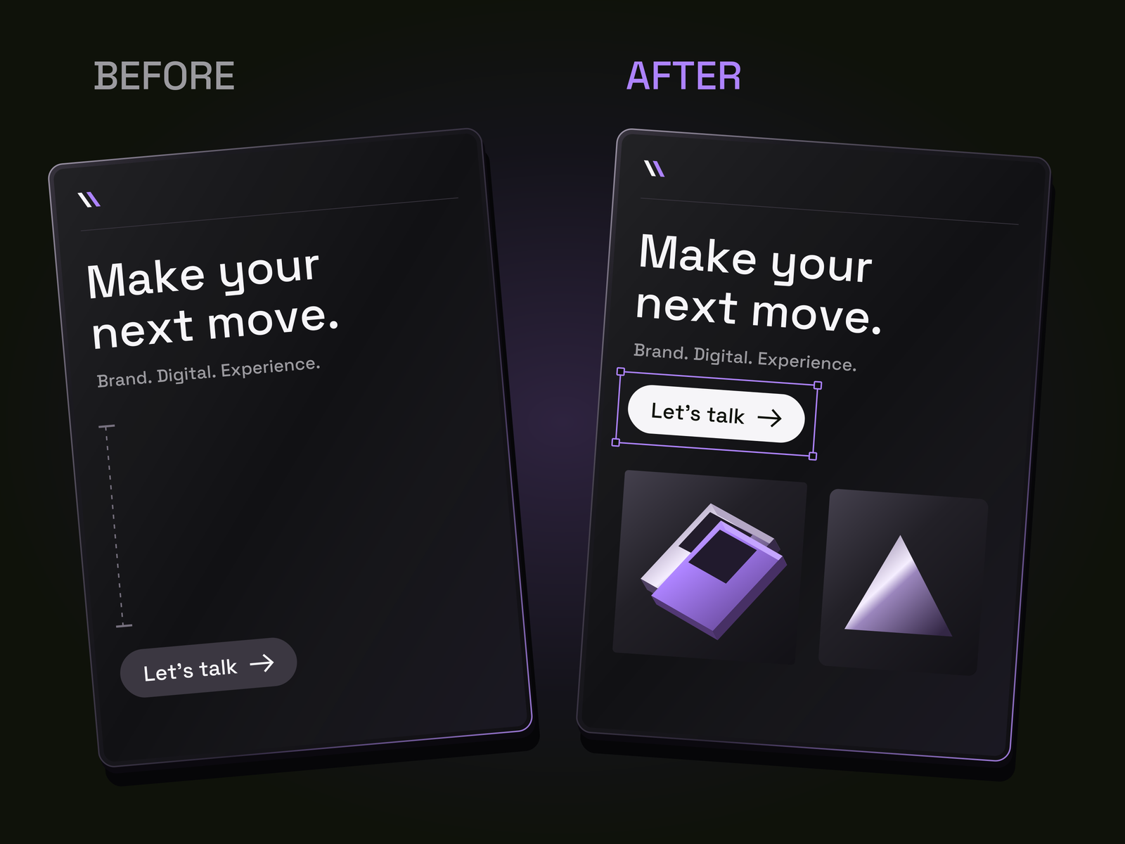
Whitespace earns its place when it makes the page easier to read. It becomes waste when it makes the visitor work harder to connect the offer, the evidence, and the next step.
A headline does not need its own full screen just because it is short. A useful explanation shouldn’t become four separate sections just to fill a template. Before adding another block, ask what new question it answers.
On a phone, review the whole scroll. Keep a claim close to the information that supports it. Bring the next action into the same reading sequence. Remove repeated promises before shrinking type or hiding important details.
Length matters less than purpose. Aim for a page where every space does a job, and the information arrives when the reader needs it.
Make the business recognizable
A website should feel like the business behind it. I want confidence, a memorable image, and the moment that makes someone stop. The impressive part still needs to serve the page.
Strong branding can show up in a distinctive type treatment, a deliberate crop, or one well-chosen interaction. Not every section has to compete for attention.
Ask your web designers what would remain recognizable if you covered the logo. Then ask whether the same design still works when the visitor reads on a small screen, enlarges the text, or navigates without a mouse.
A beautiful movement that delays the answer is a tradeoff, so treat it as one. Keep the character and remove the obstacle.
3. Score the work, but do not let a score approve it
A useful score explains a decision. “Nine out of ten” does not help the team unless it says what is strong, what is weak, and what would change the verdict.
I would score these areas separately:
- Clarity: can the intended customer understand the offer?
- Character: does the design feel specific to this business?
- Ease of use: can someone read, navigate, and act without confusion?
Agree on the scale before reviewing. One means the area fails its purpose. Five means it partly works but needs substantial correction. Ten means it meets the agreed brief, with no material weakness found in that review. A ten still makes no promise about commercial performance.
Pair every score with an observation and a next action. “The offer is clear, but the contact button disappears below a long empty section on mobile” is useful. “Needs more polish” is not.
Keep functional checks separate. A form either passed the specified test, failed it, or remains untested. Attractive typography cannot compensate for a lost inquiry. We approach launch readiness the same way: define what must work, who owns it, and what test proves it.
AI can help organize feedback or run a first review against agreed criteria. I would not treat its self-score as independent approval. Whether the first pass comes from software or a teammate, the person approving the work needs to inspect the result. An unchecked assumption stays unchecked, no matter how confidently it is scored.
4. Make feedback easy to locate and finish
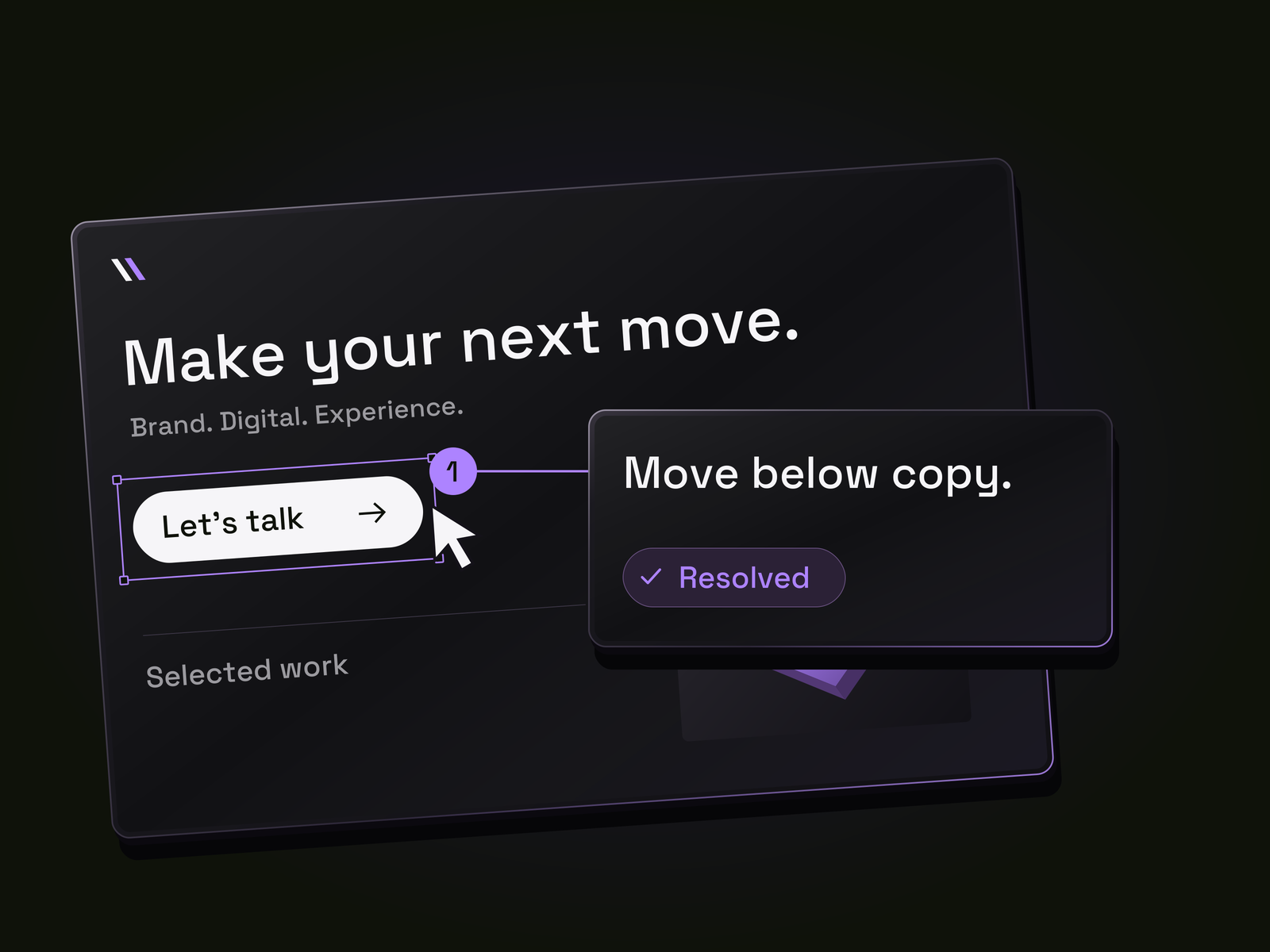
Good feedback identifies the page, the problem, and the intended result. I use Tella for walkthroughs, and others on our team use Loom. Screen recordings let us show the reading sequence and point to exactly where something feels wrong.
The recording still needs to become actionable work. “Move this up” loses meaning once it is separated from the screen. Attach the relevant moment or image, name the section, and explain what the change should accomplish.
We have also built a way for clients to leave comments directly on our custom-built sites. The purpose is simple: keep feedback next to the work, so clients never have to describe a location in a long email.
For example, “Bring the contact action directly below the service explanation so I do not have to search for it” gives the team a concrete correction. Assign an owner, make the change, and return to the same page and screen size to check it. Record what was verified before closing the comment.
5. Test the path from interest to a real inquiry
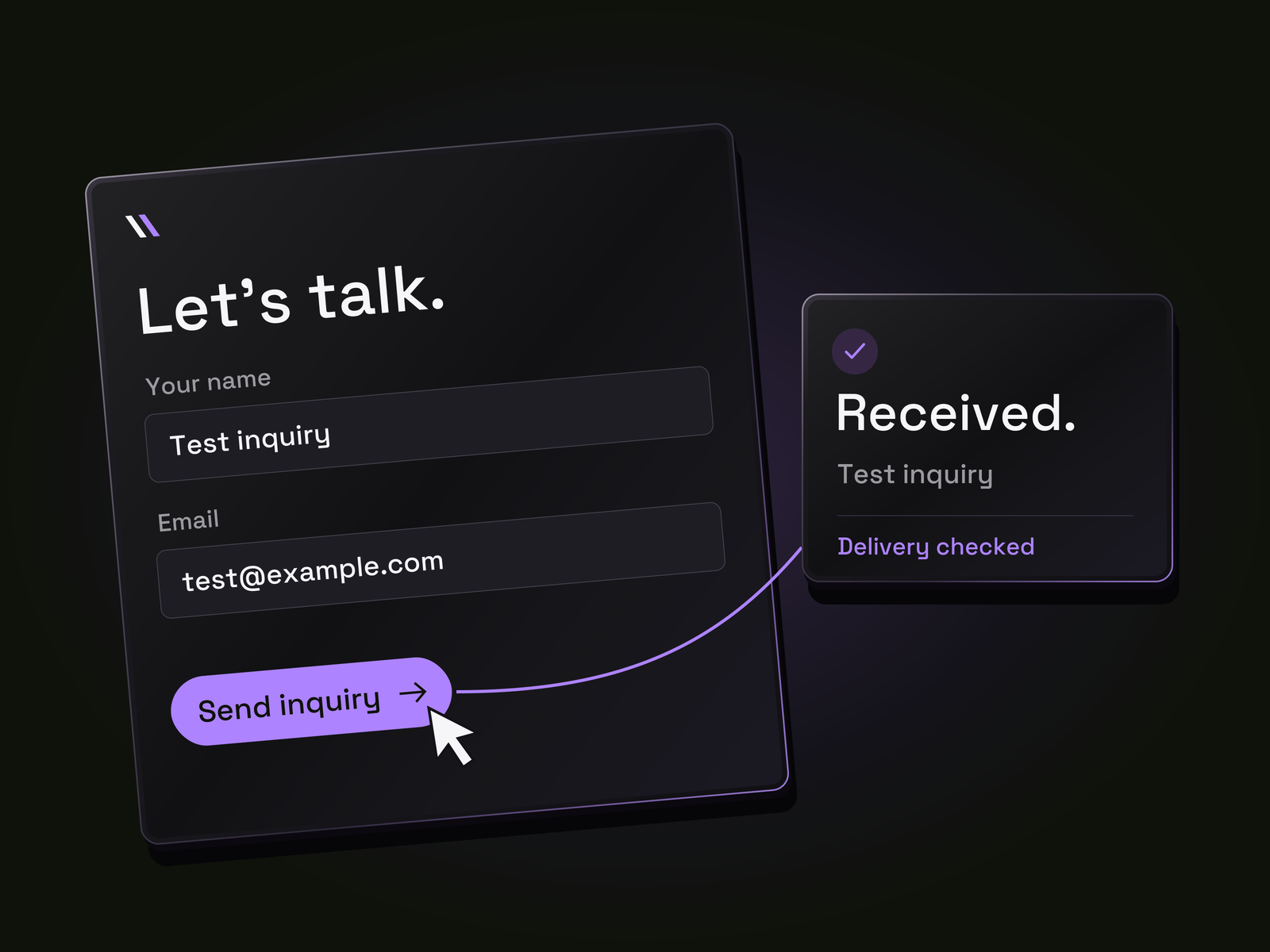
Before approval, follow the route a customer would take. Open a service page, use the navigation, complete the form, and confirm that the inquiry reaches the intended destination. Check the confirmation message too: does the person know what happens next?
Ask the team to test failure cases as well as successful submission. What happens when a required field is empty, or the request cannot be sent? Can someone recover without starting over or wondering whether the message arrived?
Before launch, confirm that inquiry tracking distinguishes a button click from a submitted inquiry. After launch, use the available source data to see where inquiries come from. A well-reviewed page is a stronger starting point, and the market still has to respond.
Before you sign off
Ask the team for a simple record:
- The page and screen size checked.
- The issue found and the person responsible.
- What changed and the evidence that it worked.
- Anything still untested or awaiting approval.
I cannot put a defensible time-saving percentage on our newer feedback process yet. I would rather track review rounds, reopened issues, and problems found after approval than claim that a faster first draft made the whole project faster.
The standard is simple: the business is clear, the design has character, and the next step works. The review should leave the team knowing what changed and the owner knowing what they are approving.
Before you approve your next website, what can your team show you beyond a good-looking first screen?
Find more Community stories on our blog Courtside. Have a suggestion? Contact stories@dribbble.com.
内容来自 Dribbble,版权归原作者所有。
阅读原文 ↗